
Improving access to mental health care.
A healthcare Eco-System case study
What the project delivered
Business saving of
£500k
per year
Improvement in user
Value
measured and improved
Increased revenue by
£110k
first quarter
Increased user
Retention
measured and improved
My role
Lead Product Designer
Leading the design process and stakeholder management.
End to End Design Process
Research through to evaluation.
Multidisciplinary team
Working alongside; Product Owners, Developers, Analysts and Testers.
2 week project
Responsible for design management and session planning.
About
Push Doctor is a peer-connecting health app designed to help people struggling with mental health issues. The app connects them with peers struggling with similar mental health concerns in order to provide a sense of belonging.
Why Push Doctor?
Push Doctor is a groundbreaking app that has been developed to help individuals who are suffering from mental health issues and are wrongly diagnosed.
With an increasing number of people being diagnosed with mental health issues, the need for alternative treatment options has become more important than ever before.
Push Doctor aims to provide an alternative to medication by connecting users with peers who also suffer from mental health, allowing them to form a community where they can share experiences and provide support to each other.
The app is regulated by healthcare professionals and since its release, has seen a significant reduction in the demand on general practitioners who had repeat patients with mental health issues.

Project goals
Reduce the demand for GPs
Create a safe space that allows users to express their mental health
Target audience
Age 16 – 65
Suffers from mental health
Users of different genders and abilities
Design process
I followed a user-centered design process to focus on the users and their needs in order to create the best possible product for them

The Empathise Phase
I identified user pain points in order to provide a great product experience to solve their problems.
User research
I conducted user interviews to gain greater insights. The interviews where conducted via audio and video calls with 10 participants.

Desk research
Through desk research, it has become clear that mental health is a significant global issue affecting millions of people across the world. According to the World Health Organization (WHO), one in four people in the world will be affected by mental or neurological disorders at some point in their lives.
Furthermore, mental health issues account for 13% of the global burden of disease, with depression being the leading cause of disability worldwide. In the UK alone, it is estimated that one in six adults experienced a common mental health problem in the week prior to being surveyed.
These statistics highlight the importance of addressing mental health issues and finding effective treatments to improve the quality of life for those affected.

Competitive analysis
Conducting a UX competitive analysis is an essential step when designing a new app or product, especially in the mental health industry.
It involves analyzing and comparing the features, functionality, and user experience of similar apps to identify opportunities for improvement and innovation. By conducting a UX competitive analysis, app designers can gain a better understanding of user needs, preferences, and pain points and use this information to create a better user experience.
Some of the best mental health apps include BetterHelp, Talkspace, Headspace, and Calm.
These apps offer a range of features, such as access to licensed therapists, guided meditations, and mood tracking, and by analyzing their UX, I could gain valuable insights into features and usability.


The Defining Phase
In this stage, I stated the user needs and problems from information gathered through the empathize stage. The problem statement, user persona and empathy mapping were involved.
Problem Statement
Our mental health app, focused on connecting users with peers and forming a community to provide support and share experiences, needs to address the user needs of feeling safe, heard, and understood while navigating the challenges of mental health.
The app must provide a user-friendly interface that facilitates easy communication and sharing of experiences while maintaining anonymity and ensuring user privacy. Additionally, the app must be designed to encourage active participation and foster a sense of community, where users feel supported and encouraged to provide support to others.
Ultimately, the app needs to provide a platform that promotes mental wellness and helps users feel connected and empowered to manage their mental health.
User Persona
I created two user personas from the information gathered from the user research to help me understand the target users better.


Empathy mapping
I created empath maps to gain better insights into our users.

The Ideation Phase
In this stage, I generated possible solutions to address the pain points and problems of the users. I was able to look at the problem from various angles and thought of innovative solutions.
I started the brainstorming process by putting users’ pain points into consideration and using the how might we method to solve real user problems. I also thought of ways to give the Push Doctor app its own identity that would set it apart from other mental health applications.
Brainstorming


User flow
User flows show the path it takes for a user to create a certain task. I created user flows to show how users would navigate through the app.


Information Architecture
The information architecture was created to organise, structure and label contents in an effective way in order for users to find information and complete tasks.

The Ideation Phase
In this stage, I worked on a paper wireframe, high fidelity wireframe, style guide and UI design.
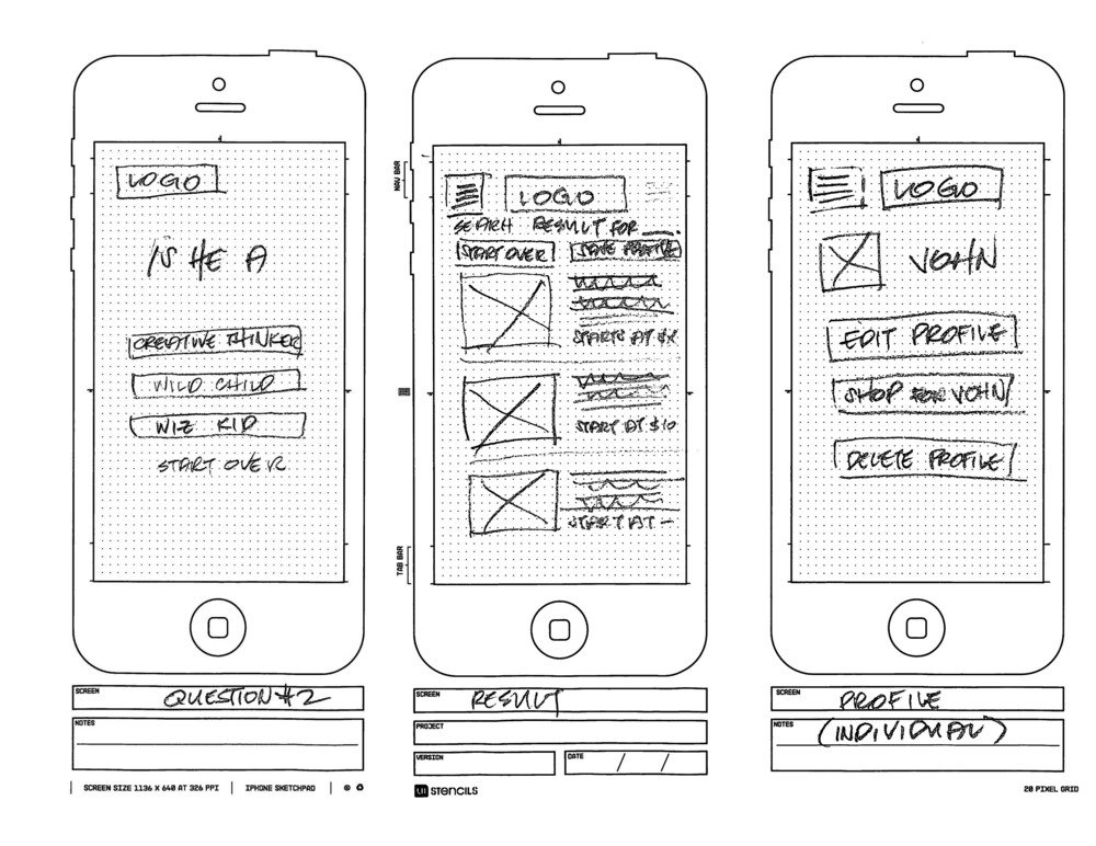
Paper Wireframe
This is a sketch that represents the skeleton app. I was able to create the paper wireframe by taking into consideration the users' needs and journeys in order to help them solve their problems.
Hi Fidelity Wireframe
I created high-fidelity wireframes using Figma. It captures the look and feel of the app it has the closest resemblance of the final design.

Style Guide
The style guide is a set of styles that defines the brand. For my colour, I chose blue because it has a trusting effect on the mind and body. For the typography, we used our own custom font PushDR Circular.

User Interface
After designing the hi-fi wireframe and creating my style guide, I designed the final user interface in Figma and ensured that every design thinking process taken was put into consideration.
Splash Screen
The splash screen also known as the launch screen is the first screen a user will see when the app is opened. It’s the user’s first experience with the app.

Onboarding Screens
The style guide is a set of styles that defines the brand. For my colour, I chose blue because it has a trusting effect on the mind and body. For the typography, we used our own custom font PushDR Circular.

Personalise app screens
In these screens, users are asked questions to help improve their experience and to figure out their specific needs.

Community Screens
The main purpose of the community screen is to allow users to connect with peers that are struggling with mental health issues. With the community screen, users can create posts to explain how they feel and interact with others.

Home Screens
The main purpose of the home screen is to provide self-help techniques to improve mood and mental health. Users can listen to music, sleep stories, meditation series and many others to help them feel better.

Message Screens
Users can send messages to others Emojis and Voice messages can be used for better expression and communication.

My Profile Screen
The screen is the user’s profile that shows their details, posts and settings option.

Settings Screen
Users can edit profiles, select their preferred language, contact the helpline in emergency situations and many others.
The feature that really stands out the most in the settings screen is the profanity filter that helps to filter obscene language that is offensive and can incite violence.

The Prototype Phase
All Screens

Accessibility Considerations
Accessibility in UX focuses on enabling access for people with disabilities. Accessible designs do not only benefit people with disabilities, but it also ends up benefiting a much wider audience.
-
Good colour contrast that meets WCAG contrast requirements in order to impact readability for all users especially those with visual impairment.
-
Use of informational icons that are easily understandable to the users in a single glare and well-labelled icons in the navigation bar.
-
Use of imagery to make the design more pleasant and easier to understand for users especially those with cognitive and learning disabilities.
Test
During this stage, users' solutions are tested and their feedback is collected to gain a deeper understanding of their needs and to solve any potential problems. Although it is the final stage of the design process, it is not always a linear one, as testing results can uncover new insights about users that may require iteration of previous design thinking processes.
Usability Test
I conducted an unmoderated usability test with the end users, asking them to perform various tasks to gather direct feedback about the product. The goal of the test was to iterate the product based on user feedback until it aligns with the product goals, ultimately solving any problems faced by the users.
Key Insights
Participants were really excited about the app personalisation screens.
Easy navigation
Participants really love the soothing effect of the app and the colour usage.
Participants complained about the first seek bar in the music player screen which was later iterated for a better experience.
Future Concepts
Playlist generated by users’ mood
Video and audio call interface
Mood checker
Challenges
Designing a mental health app in just two weeks can be a daunting task, particularly given the complexity of mental health and the need for sensitivity and nuance in addressing it.
There were numerous challenges to consider, such as how to create a user-friendly interface that balances clinical accuracy with approachability, while also ensuring that the app meets the necessary regulatory requirements.
Another significant challenge was arranging user testing with participants who are willing to provide feedback on such a sensitive and personal topic.
Conculsion
In conclusion, the project discussed above highlights the critical importance of UX design in solving both business and user problems. By placing the user at the centre of the design process, the project team was able to develop a mental health app that met the needs of its target audience while also aligning with the project's business goals.
By using UX design to create a user-friendly interface that balances clinical accuracy with approachability, the team was able to create a product that was both effective and accessible. The project demonstrates how, by prioritising UX design, businesses can create products that not only solve user problems but also provide significant value to the company.